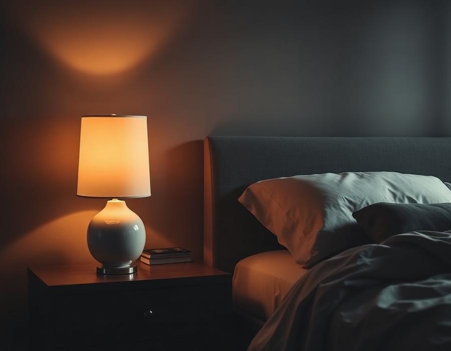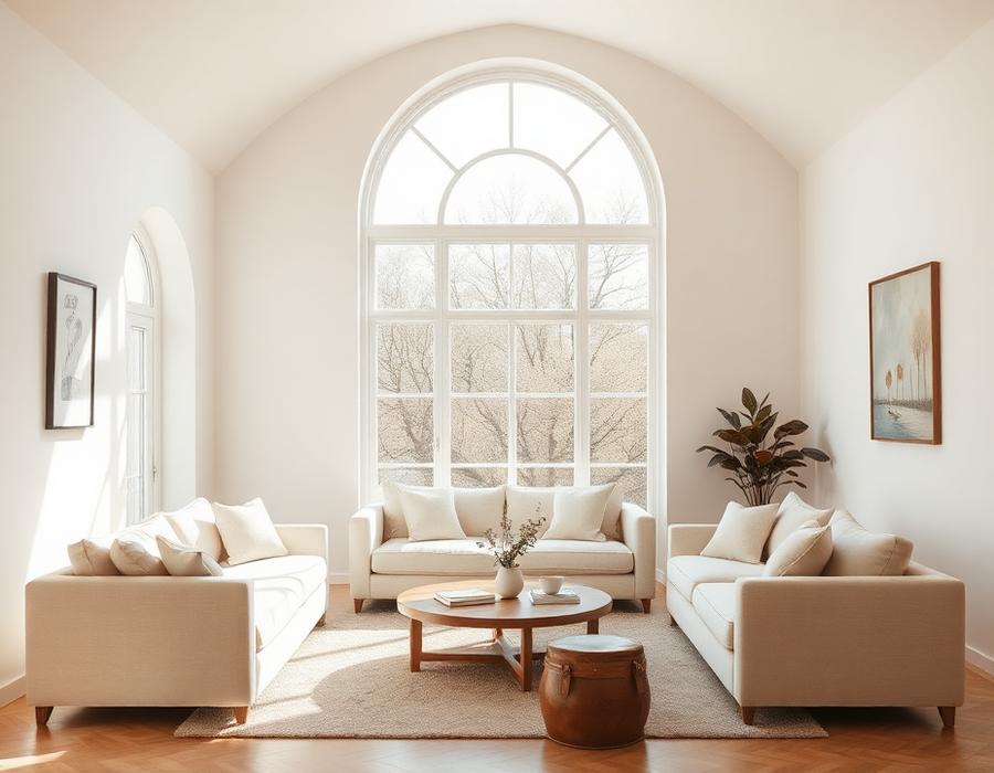
The critique arrives almost on cue: neutral rooms are safe, beige is boring, all this cream and stone is just an absence of decision. It is usually made by someone looking at a photograph. In person, a well-composed neutral room is one of the most decisive spaces you can stand in.
01 — Depth
There is no such thing as one white
A considered neutral palette is never flat. It is built from six or seven closely related tones — a warm limewash on the walls, a cooler chalk on the ceiling, a putty linen on the sofa, a bone wool on the rug, a pale oak on the floor, a soft plaster on the fireplace. Each carries a slightly different temperature. Together they read as calm; apart they read as considered.
The mistake most rooms make with neutrals is to specify one white and repeat it. The result is a hospital. The remedy is to specify six and let them speak quietly to each other.
02 — Texture
When colour steps back, texture steps forward
In a strongly coloured room, texture is background. In a neutral room, texture is the entire foreground. The nap of a wool rug, the slub of a raw linen curtain, the tooth of a lime-plastered wall, the grain of a rift-sawn oak — these become the events of the room, and they reward every angle of light.
This is why neutral interiors so often look best in person and only adequate in photographs. The camera flattens what the eye reads as depth. Standing in the room, you feel it immediately.
“Neutrals are not the absence of decision. They are the sum of many quiet ones.”
03 — Restraint
The confidence to leave things alone
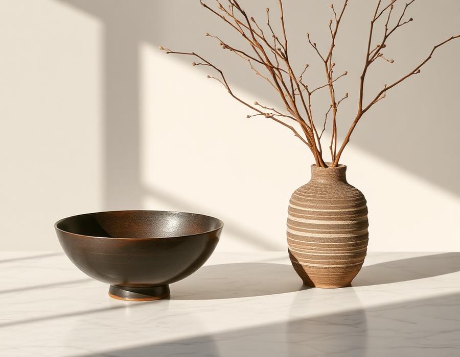
A neutral palette does not mean an empty room. It means an edited one. A single copper vessel on a plaster mantel reads as a jewel. Set the same vessel in a room of competing colour and it disappears. Neutrals give the objects you love the stage they were made for.
This is the discipline the palette asks for in return: to buy less, and to buy more slowly. To let the room settle around each addition before making the next one. Calm is not achieved by decorating in a hurry.
A well-curated neutral palette is not a look — it is a temperament. It rewards the client who wants their home to be a place of recovery rather than a place of performance. Done well, it does not date, because it was never fashionable to begin with.